Lynk & CO
Challenge
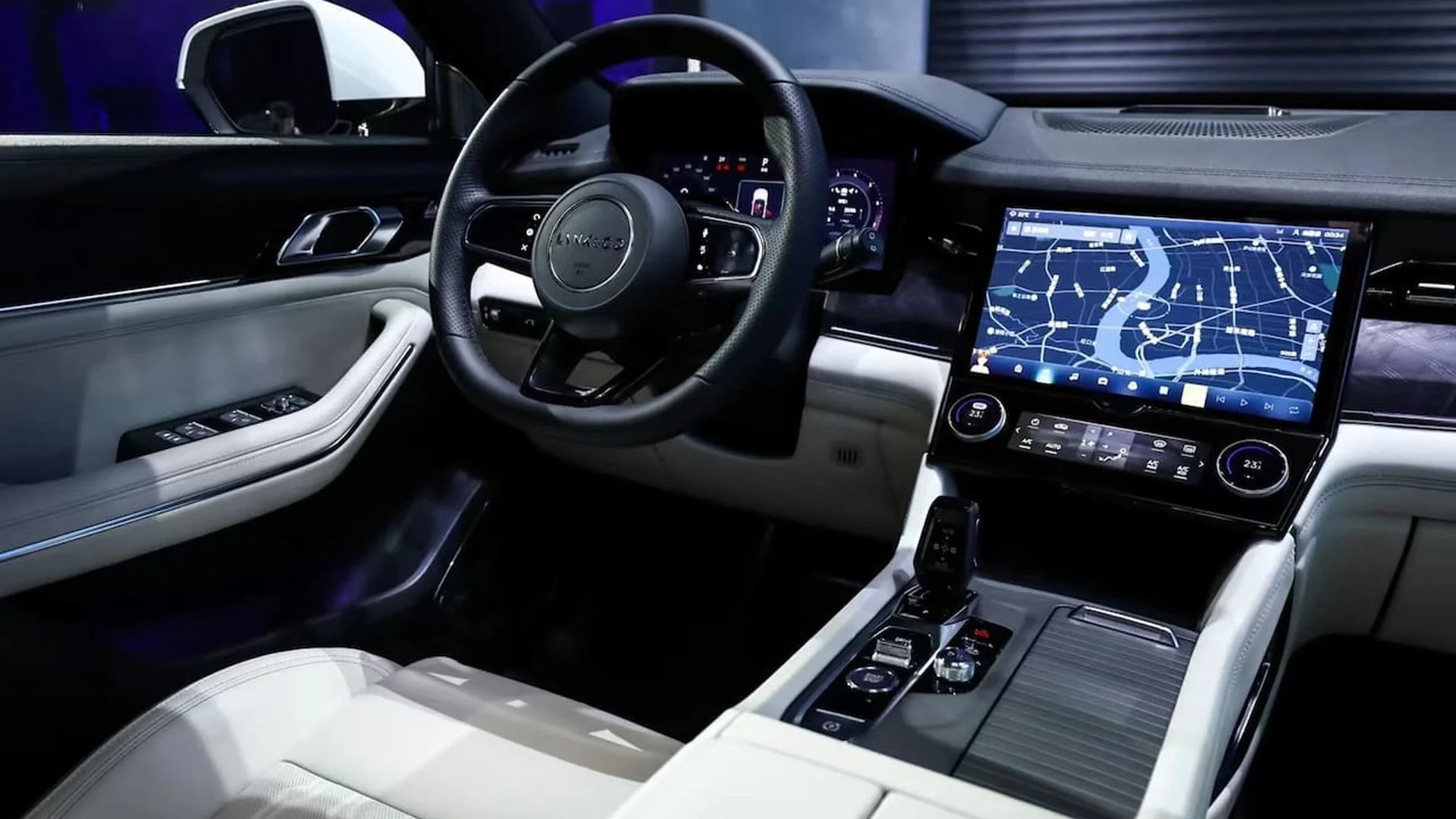
This infotainment system integrated too many functions into a touch screen. Too many interactions create a complex menu in the current design.
Here are our client’s demands:
Reduce the learning curve for new user
create a easy-to-learn experience Reduce hierarchy if necessary
improve the user flow Explore the interaction with 3D elements
Most popular EV in CHIna
Direct competitor in China
target competitor
Competitive Analysis
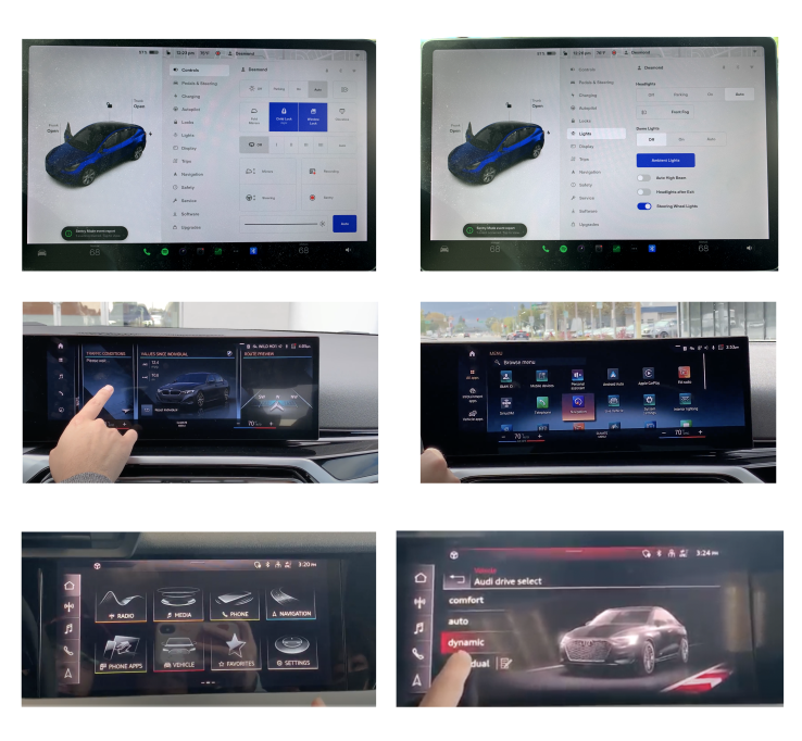
Hierarchy is user-friendly, both Tesla and XPENG use text and 3D animation to display menu
Switching between different menu is easy, BMW had editable widgte in homepage. Driver can set their prefered function in homepage for a quicker access.
Most common used functions have good accessability, like Audi have a navigation button can be accessed from anywhere.

Measure of Success
We will compare the user flow before and after to see what’s our improvement.
Does it shorten the hierarchy and improve the user flow
Does it clear confusions? Were they able to pin point actions, or they have to go back and forth?
We will conduct usability test to define the learning curve for new users. And we will compare the results.
Does it made it easier for the user to find specific item
Does it simplify the learning curve and create a easy-to-learn experience
Does the icon works? Are they intuitive?
We will interview the user to see if they are satisfied with the design
Does the user feel they are using a luxury product?
How’s their learning experience?
Target Audience
Joseph
28Yrs Old
Project Manager
Married
Common needs of a car:
Daily commute to work and return home, 2-3 days per week
20-25 mins commute time from home to office, always have traffic in the morning
Always go out with partner on weekends, drive 1-2 hours away from home to relax.
Demands for the car:
EV, can charging at home and cheap on running cost
At least seat for 5, can hang out with friends on weekends
Has drivers assistence so less pressure in traffic
Has good interior design, makes long time driving comfortable


